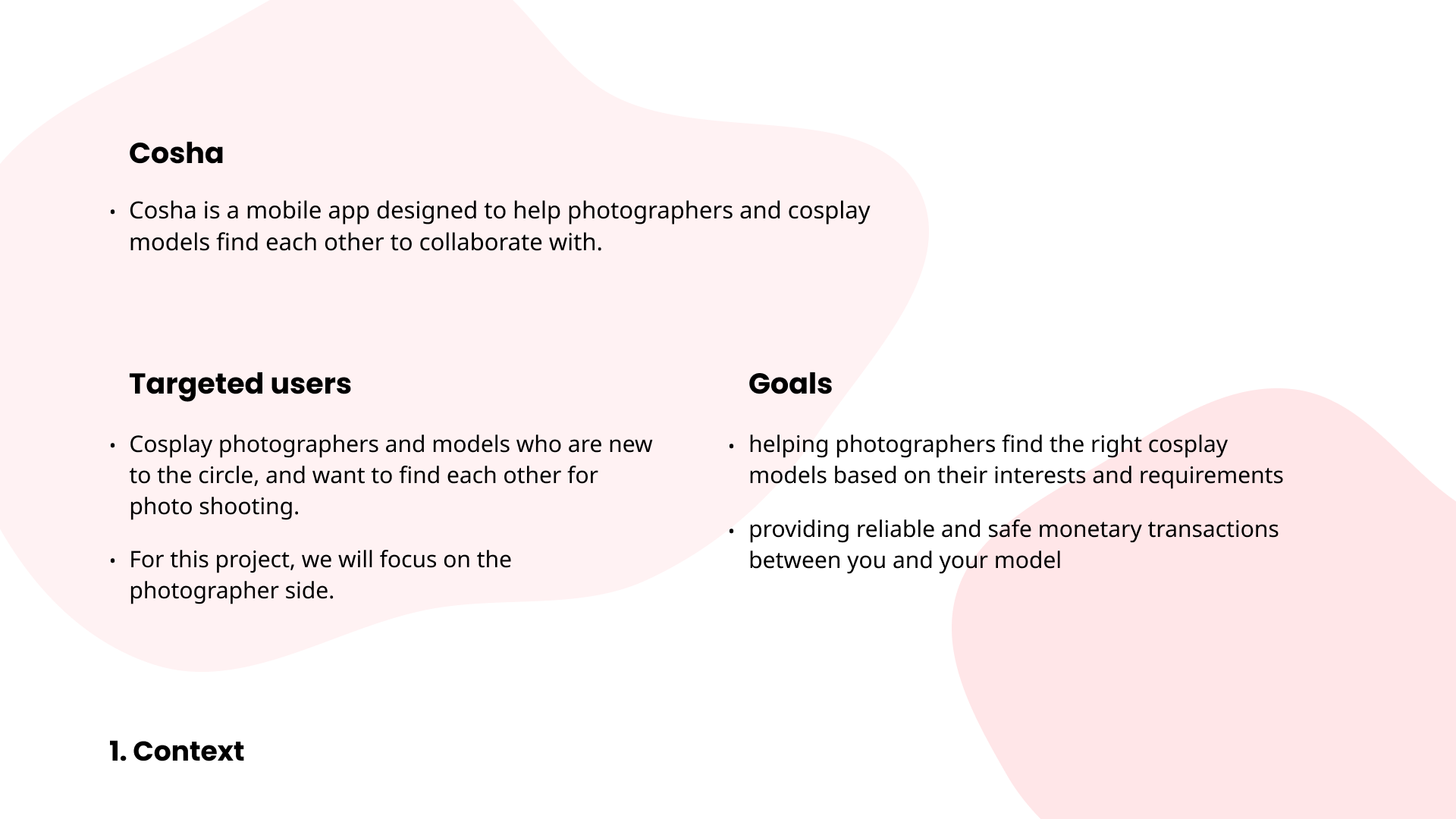
Cosha
Cosha is a photo-shooting app for cosplayers and photographers. I work as a project manager, design lead, UX, UI, user research, prototyping, animated video editing.
Background
Project Type
School Team Project, Product Design
My Role
Lead UI, UX
Date
Spring 2020
Showcase Video
Ideation
Concept
Cosha is a mobile app designed to help photographers and cosplay models find each other to collaborate with. We aim to make a user-friendly app that is designed to make the process of shooting a cosplay photo as easy as possible.
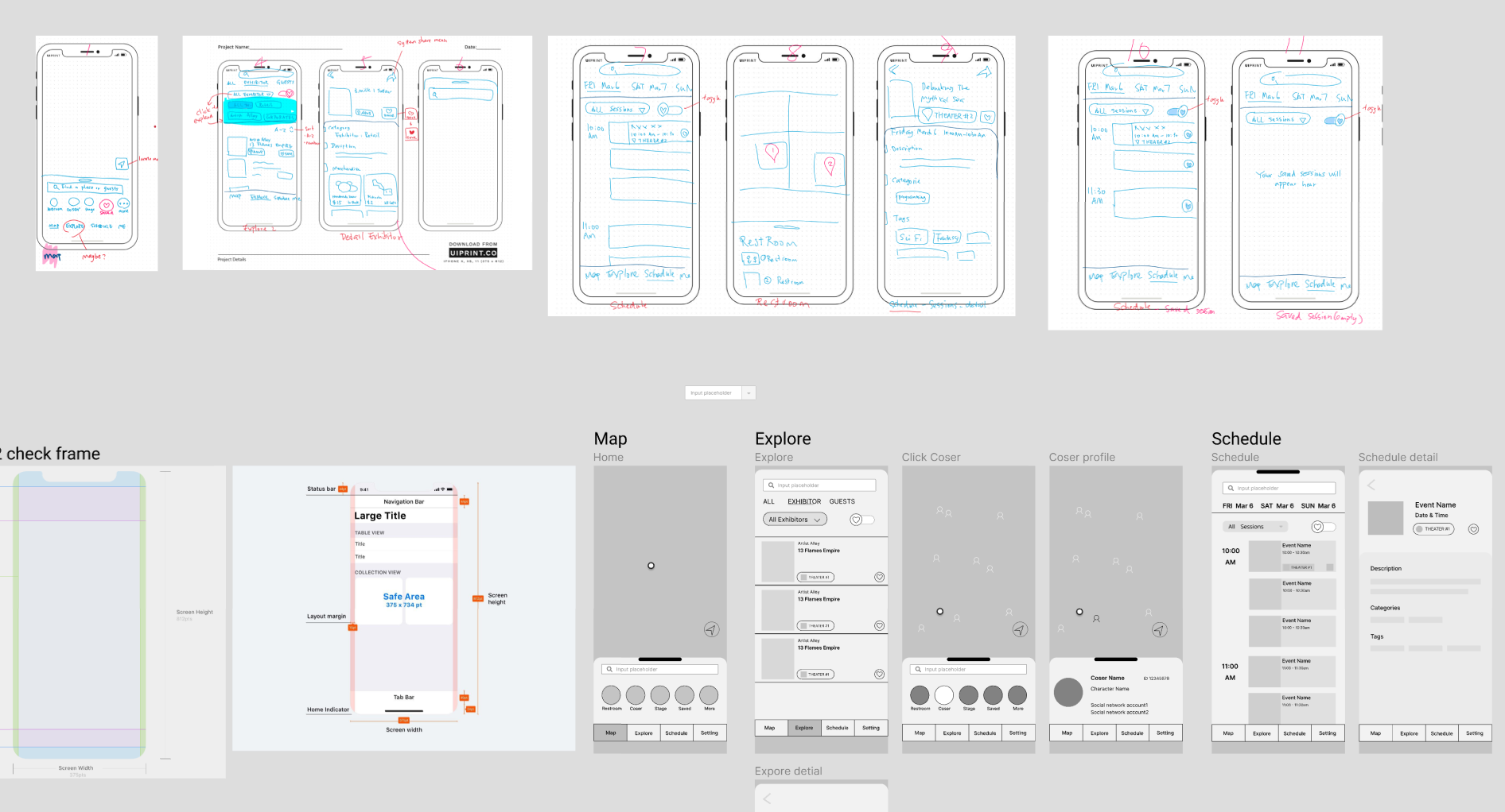
I started to work on the app design and used OneNote to sketch out its layout. We transferred my sketch into wireframes in Figma.
Unfortunately, we felt that the booth finding app is not a good idea for this product design project. First, the structure of the app highly depends on what the venue and booth owners providing so it's hard to find the content resource for design. Second, the app does not involve a lot of user interaction. Third, anime expos only open once a year, so the app is not useful for most situations.
The Idea of Cosha
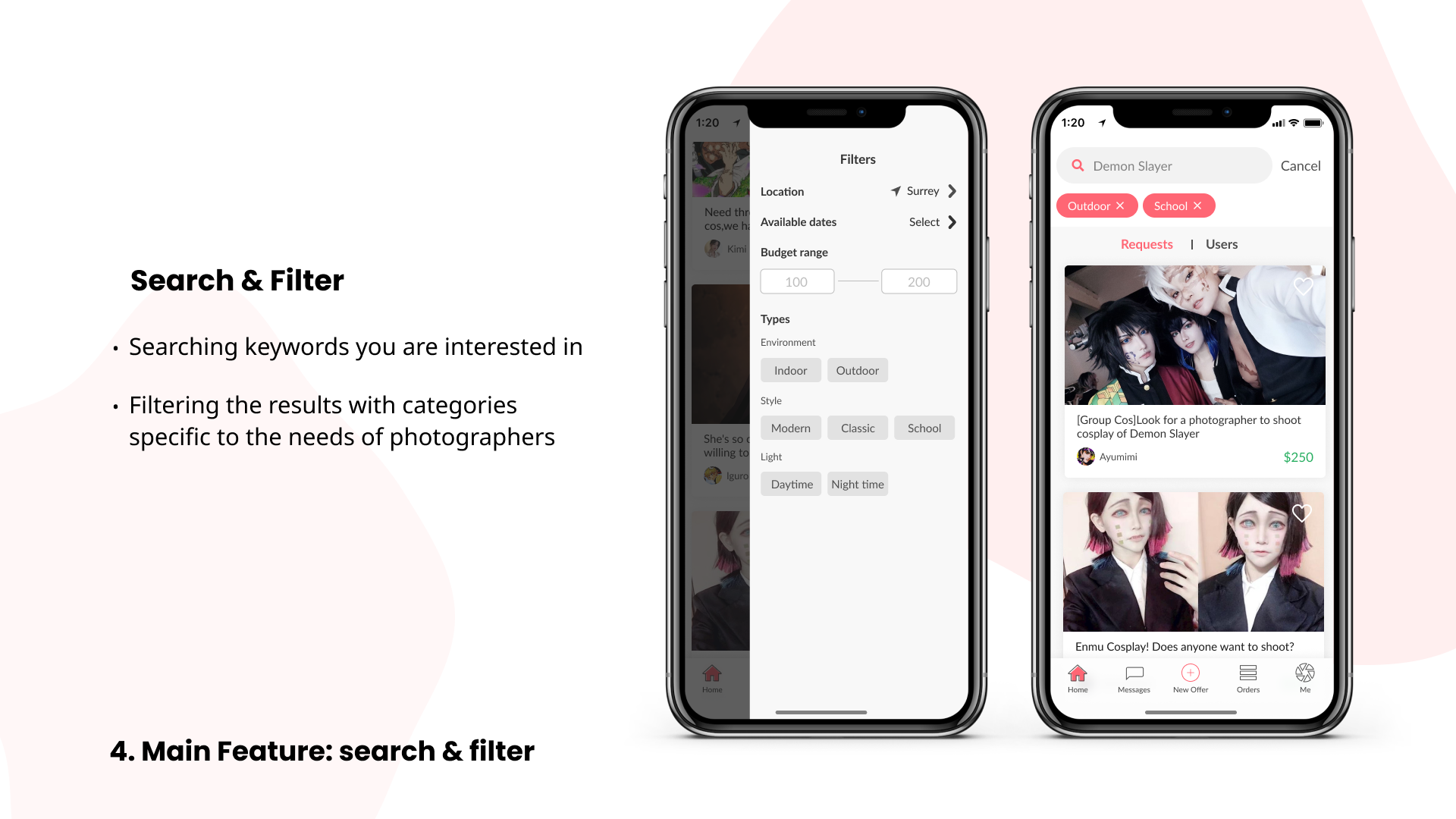
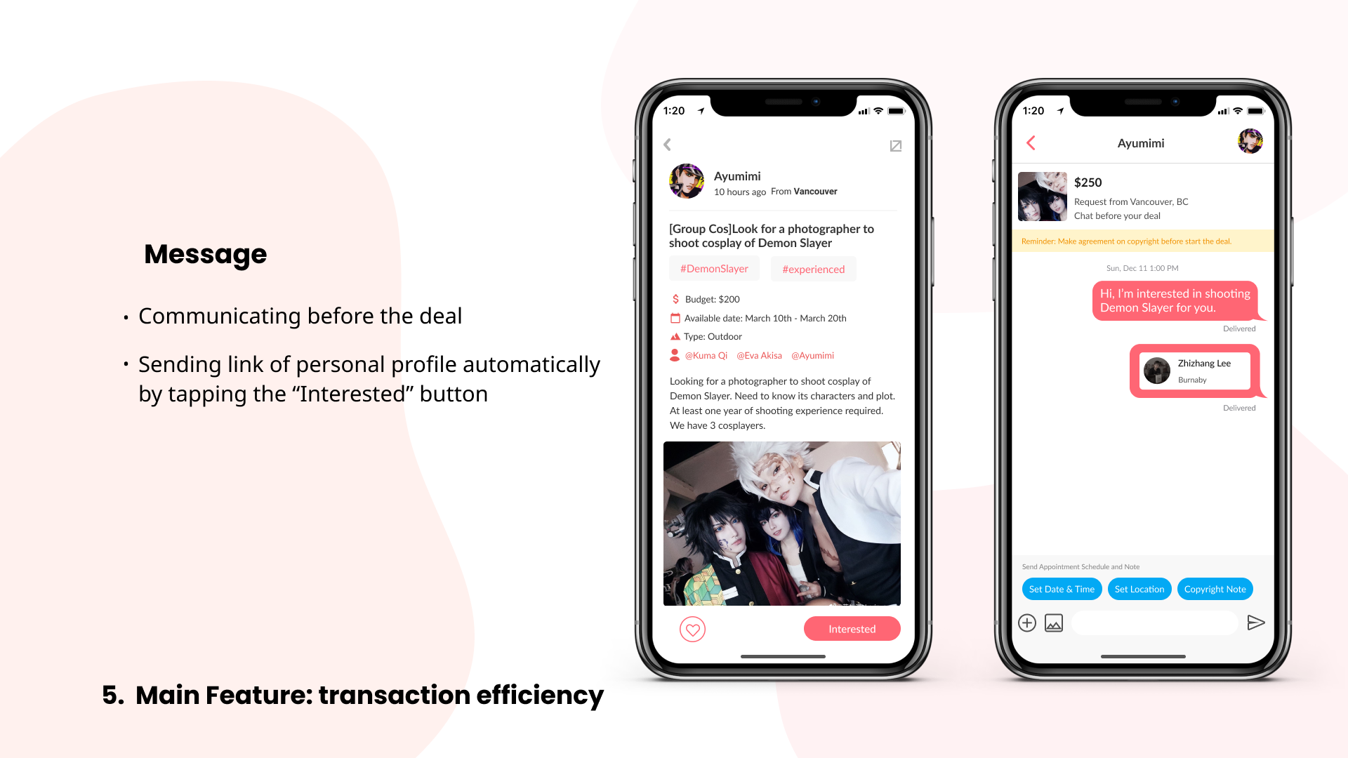
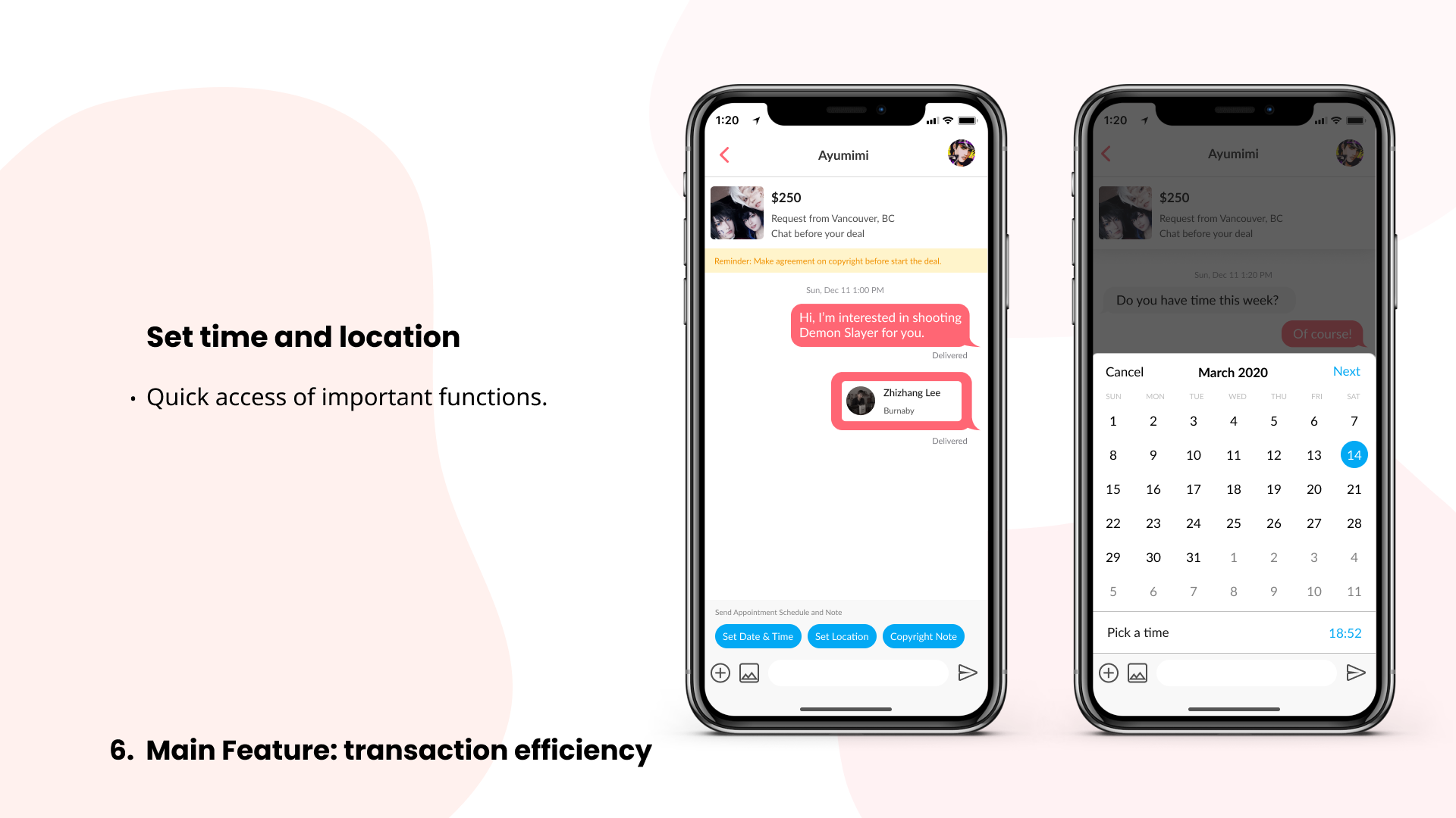
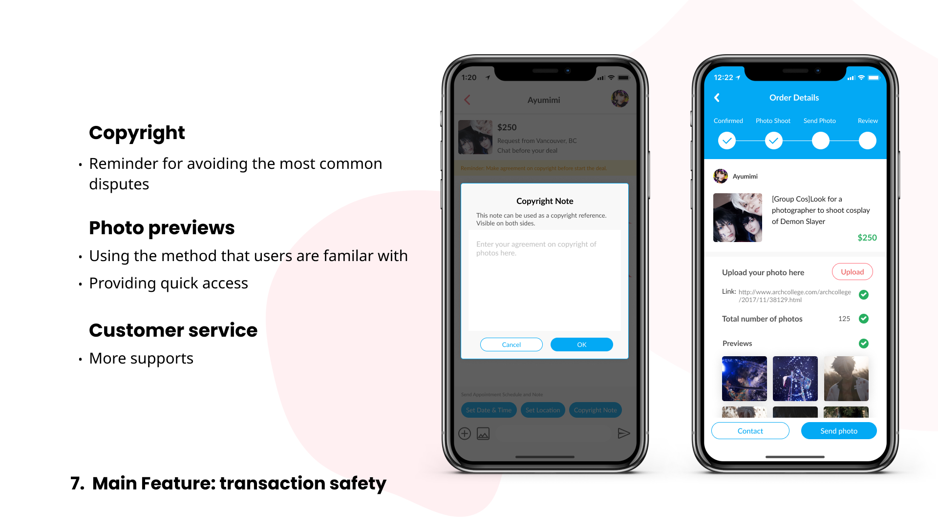
We still got ideas to explore. Then with interviewing our cosplayer and cosplay photographer friends, we shifted our focus onto the group of cosplay enthusiasts . We found out that there was not a well-designed app that dedicated to solving the pain points of finding each other, unsafe transactions, and poor time management. I named this app Cosha.

Design
We are a team of 5 people making this product design project. As the Lead UX/UI designer in this team, my main task in the team is to confirm the user flow and composition of UI elements. I was able to communicate my ideas to my teammates, and they helped in transferring my ideas to the digital canvas.
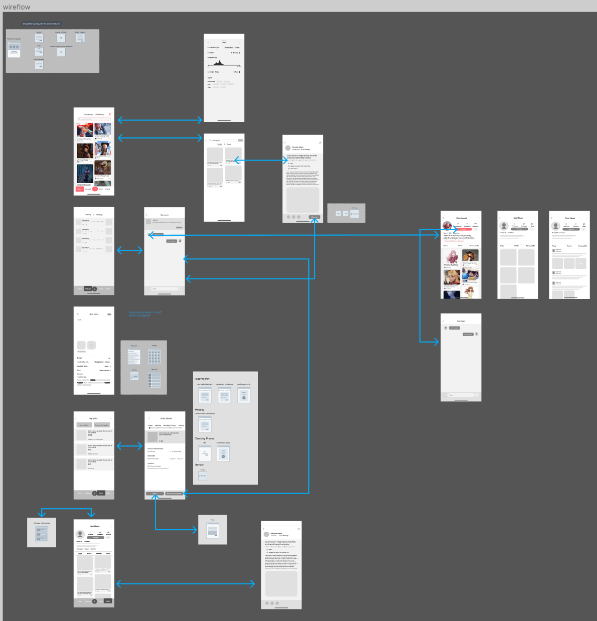
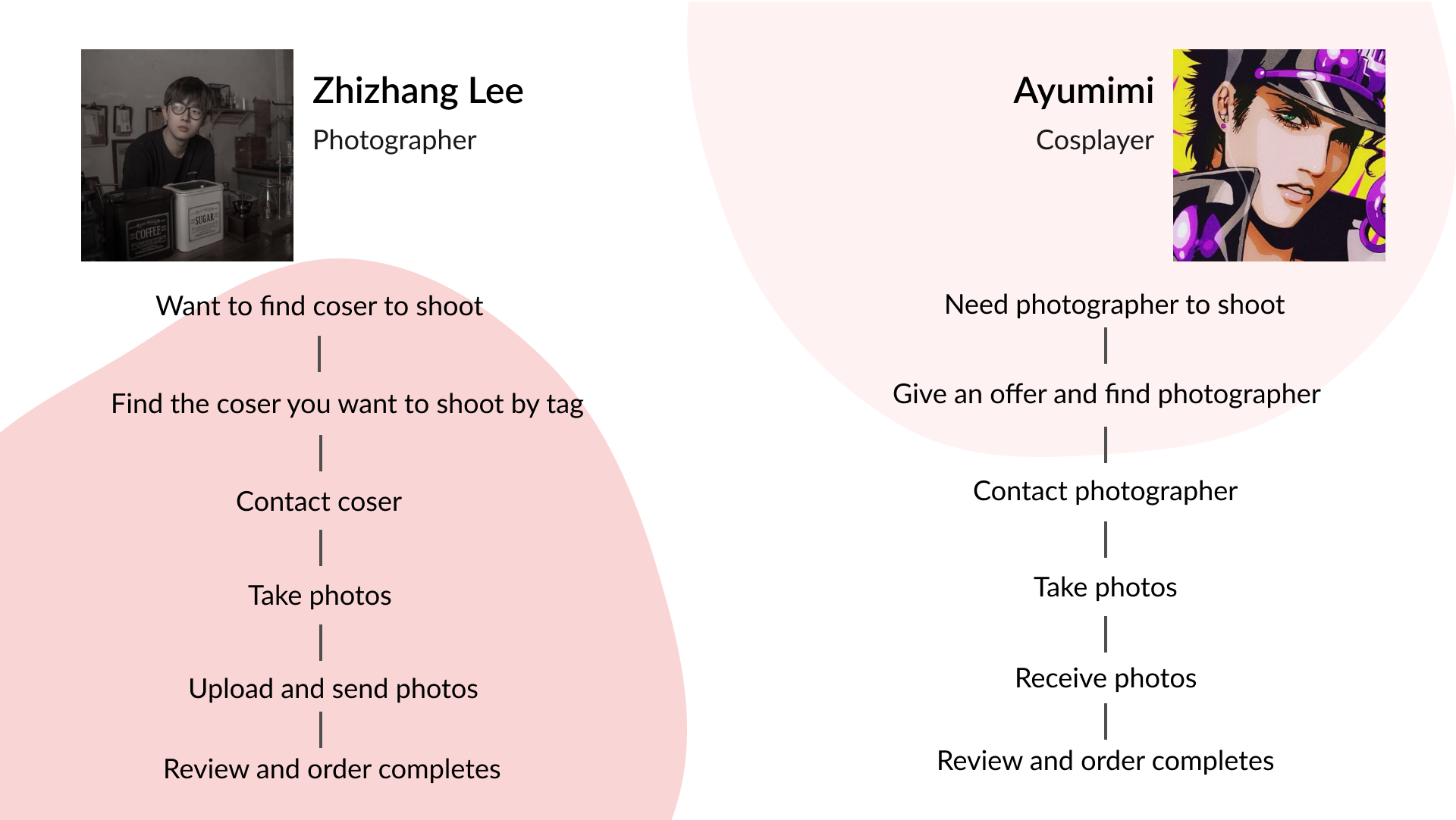
I drew user flow to show how users explore the app.
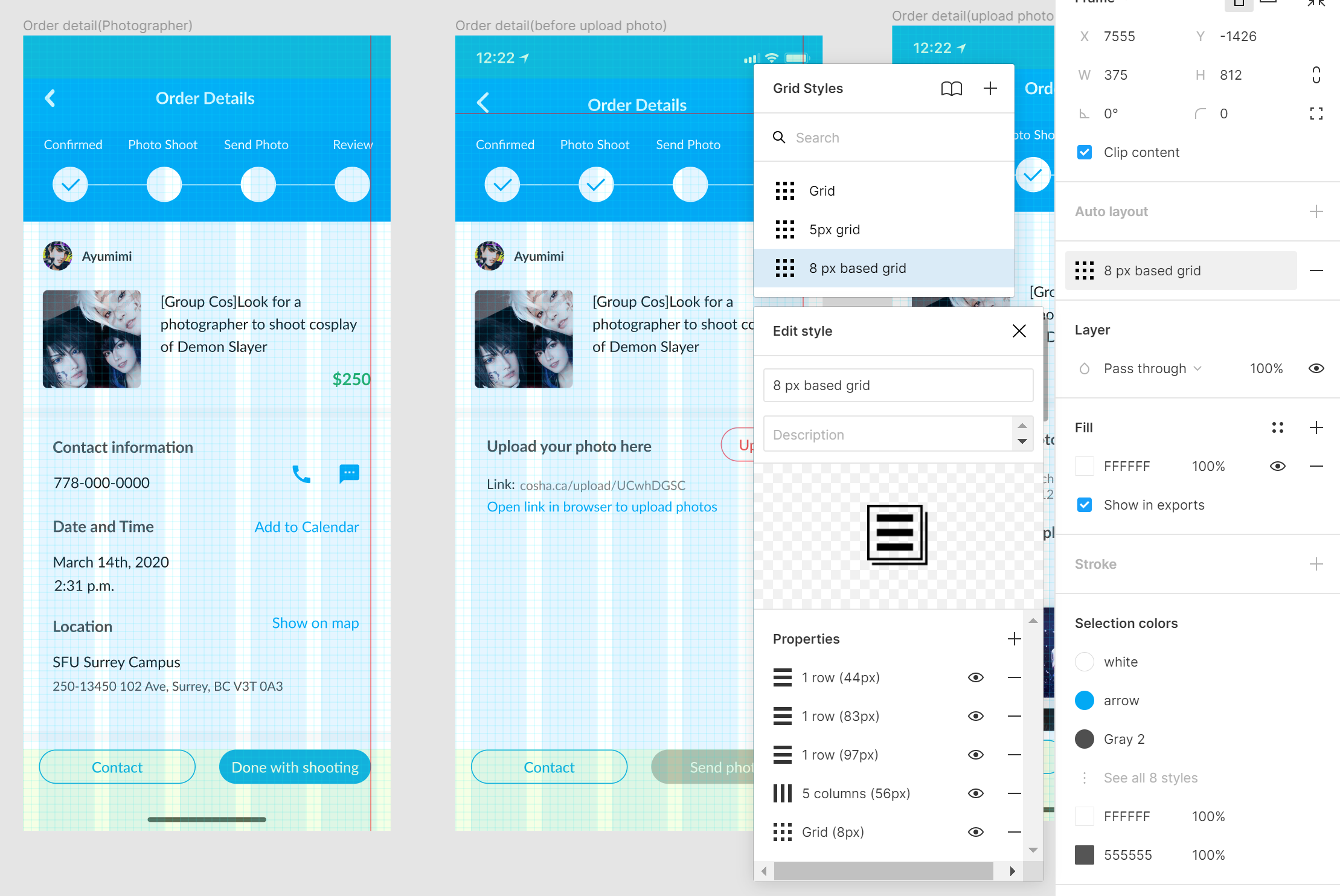
Design System
Most of my teammates do not familiar with Figma and Mobile UI design, so I taught them a lot of techniques on using Figma and Industrial Standards of Mobile UI (in this case is Human Interface Guidelines of iOS.) I managed to fix a ton of incorrect alignments, font usage, colour usage, layer placements, naming, etc. To reduce my labour work on small fixes, I also taught them how to take the advantages of Figma like pre-defined fonts and colours. My teammates were happy to adapt to the components I created.
I felt my experience of being a Design Instructor in Techbytes helped me on communicating with my teammates because I teach design tools including Figma in workshops.
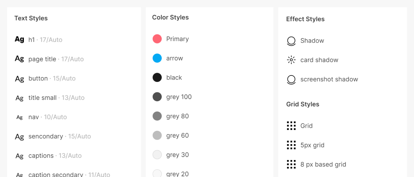
I designed a grid system by learning from iOS HIG
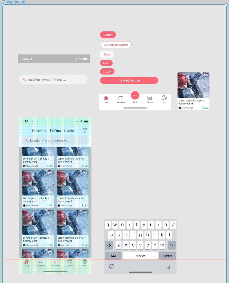
I made Figma Components to reuse UI elements. Figma is an awesome UI design tool because it allows us to save a master component as the template for later copypasting and centralized editing. I love this feature and I recommend it to all my design friends.
I also designed icons. With several iterations, it now looks like an aperture in a pink background. I used orange-pink to identify the anime lover group, and a geometric combination of aperture signs to signify photographers.
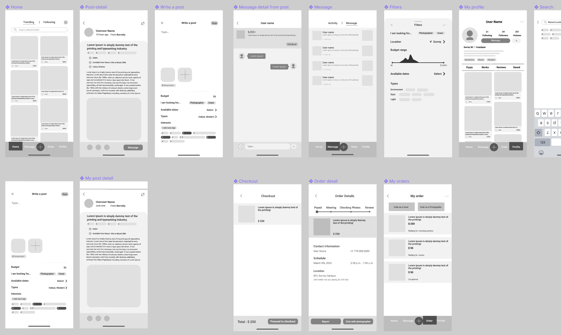
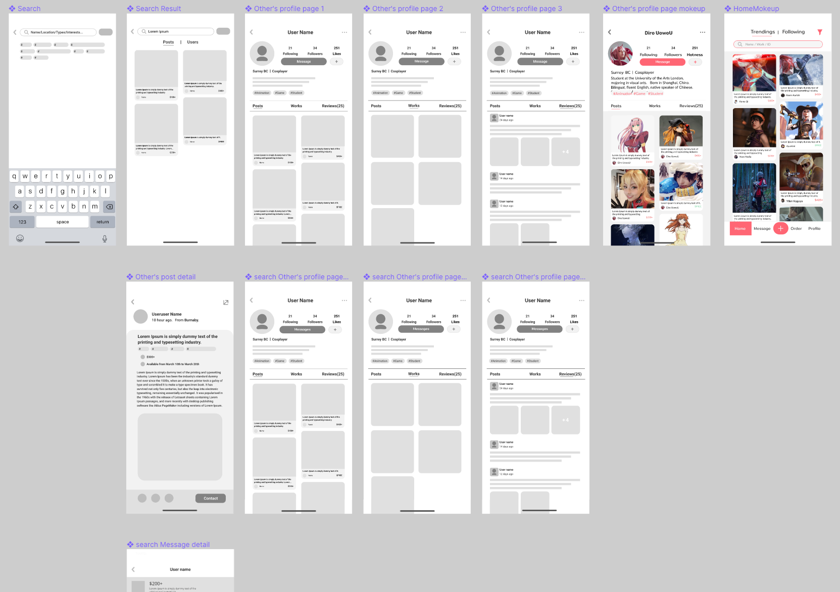
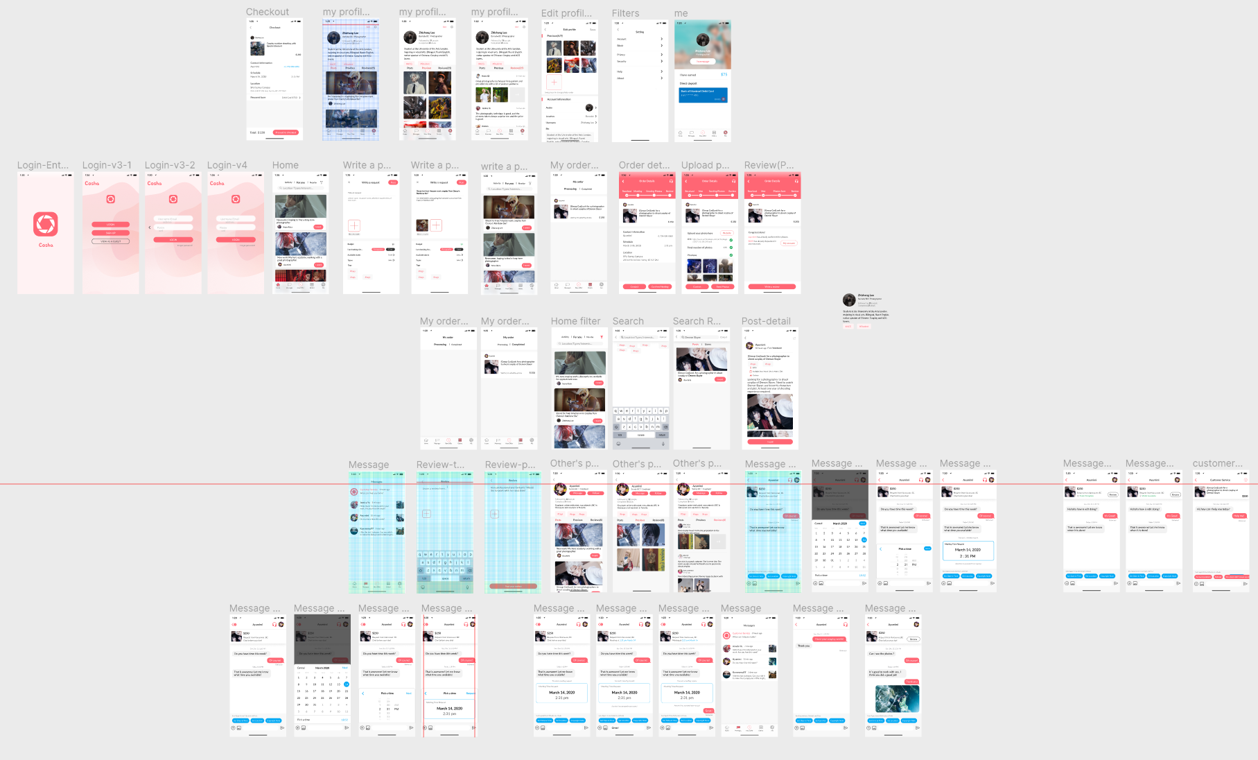
Prototype
We worked together use Figma to complete the full interactable prototype. I made our final showcase video with the prototype with Animating in After Effects and Editing in Premiere Pro. (Video at the top of this article)
Link to the prototype
Showcase (Continued)
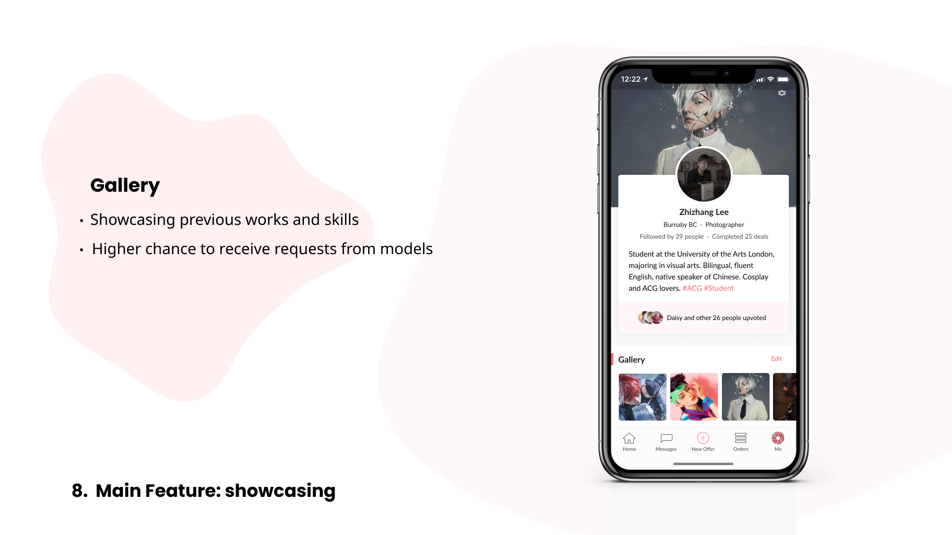
Here are more screenshots of the app. Take a closer look at the app and see how it works :)